Showing posts with label Tips. Show all posts

Saturday, May 26, 2012


If your drawings look flat, check your foundation. This drawing has depth and it couldn't be simpler.

Great shading can't fix a a flat drawing.

Monday, March 26, 2012

A Quick Illustrator Tip


If you're aligning objects in Illustrator tap "Control + U" first. This shortcut turns on the smart guides. The Smart Guides will show you intersection lines and cause objects to snap to anchor points, paths, etc.

Leaving them on all the time, however, makes my head want to explode.

Thursday, November 17, 2011

Want to Be Better?

Being better isn't about trying harder. It's about thinking differently. It's about thinking better.

Change the way you think.

Friday, October 21, 2011

Illustrator Pixel Preview

A while back I  learned about a preview mode in Illustrator called "Pixel Preview." I wasn't sure why anyone would use it until recently.

The Pixel Preview is good for viewing Bitmaps.

Bitmaps looks strange in Illustrator if you're using the regular viewing mode, but I recently discovered if you change the view mode to "Pixel Preview" you can see how the bitmap will look when printed.

By the way, in case you aren't familiar with bitmaps, I'm talking about the kind of file you would get if you went into Photoshop under "Image," then "Adjustments" and converted your image to Bitmap mode. Bitmaps are one color images with transparent backgrounds. Screen printers use them a lot.

A bitmap normally looks like this in Illustrator:


They look rough. If I'm setting up a proof for someone to see how their graphic is going to look on a T-Shirt I can't use this. After trying some roundabout methods of getting good images for proofs when using Bitmaps I discovered the "Pixel Preview."

This is how the same graphic looks in Pixel Preview Mode:

This more accurately represents how the image would look printed on a T-Shirt. You can change the view mode in Illustrator by going to "View" and "Pixel preview":


Just change your view mode to Pixel Preview before saving the file and you'll easily have a more accurate proof.

This mode is also useful for Bitmap distress patterns.


Monday, October 10, 2011

Tips for Drawing Buildings


I was recently asked to draw a courthouse that was given as a retirement gift to someone. I'm asked to draw buildings from time to time, so I was inspired to share some of my best advice on getting them to look good.

Learn the Basic Rules of Perspective
There are books full of perspective tricks and information that will allow you to do things like draw a flagpole 90 ft away and 60 ft high accurately. You don't necessarily need to know that kind of thing.

What you do need to know is how to draw in 1 and 2 point perspective. Learn about vanishing points and horizon lines. If you understand the way perspective works you will be able to keep the various elements of your drawing in perspective with one another.

Cheat
If you're asked to copy a photograph there is a great trick that will save you a ton of time.

Print the photo you're working from on a piece of paper (probably 8.5"x11"). If you're drawing on a larger piece of paper than 8.5"x11" do this: If you have Photoshop or something similar, set the photo size to the same dimensions as your drawing paper. Crop the image and set it up just as you plan to draw it. Then, reduce the canvas size to your print size.

Take your printed image and rub pencil all over the back. I like to use a fat piece of graphite (something I would load into a clutch). Once the graphite is all over the back you can lay your photo directly in the center of your drawing paper and tape it down. Draw over the image with a pencil. The graphite on the back of the photo will be transferred to your paper. You can do this to create a guideline to work from. I would suggest copying the lines as accurately as possible to save yourself some grief later on.

Remember to Interpret
It's easy to get caught up with the ruler and bust out straight line after straight line, forgetting that art is best when we inject a little personality. Don't forget to add some style.

No Right Angle Cross-Hatching
If you're shading with hatched lines make them cross at diagonals, not at right angles. If you don't believe me, try it.

Make Lines Straight, Not Perfect
Walls are straight on average, but if you get close you can see the imperfections...the notches and bumps. Do that.

Dramatize With Lighting
Use strong lighting to create a sense of drama and interest in a static object.

And that's all you get. Oh yeah, buy a triangle straight edge.


Friday, September 23, 2011

Some Advice from a Screen Printer


Oh, the horror!

I am a Graphic Designer at a screen printing company. Every day I get artwork from people that is hard to use and hard to print. In an effort to help my screen printing brothers and sisters...some advice for those who make t-shirt graphics and those who order t-shirts:

1) Vector artwork is good. Everything else is bad 98% of the time.


Here is an extremely brief and important introduction to screen printing graphics. If you don't understand vector art please read.

Vector artwork can be made bigger or smaller and the quality will never change. If you have a vector image it will end with .EPS, .AI or .PDF.

.JPG's, .PNG's and .GIF's are not vector. If I make them bigger they will look worse. They are jagged. I can't print them. Don't send them to me.

Why does this matter? Because I can't print the individual colors of a .JPG, .PNG, or .GIF.


I print 3 types of files...Vector, Bitmaps and Grayscale.

Bitmaps and Grayscale images aren't vector. That means I can only use them if you want to print in ONE COLOR.

If a student drew a nice picture and you want to put it on a shirt, feel free to send me a high quality .JPEG if you want it printed in ONE COLOR. That is the only time I want a .JPEG.

The difference between Bitmaps and Grayscale images? Bitmaps are 1 color only. Grayscale can use tints and  shades of the same color. I can print a Norman Rockwell painting on a shirt in Grayscale in one color.

2) Expand all text when sending vector art.


When I say "font" I'm talking about text. Times New Roman is a font. Comic Sans is a font. If you send me a vector file and you used a font that I don't have installed on my computer, my computer will substitute a different font. The result is a messed up graphic.

If you select your text and go to "Object" at the top of the screen and "Expand" the text is changed into shapes. That means I don't need your font anymore.

Expand your text when sending work to a screen printer.

3) Don't Use Clipping Masks.


I hate them. It's hard to change the artwork when someone has used a clipping mask. Use Pathfinder options to get rid of everything you don't need instead of using a clipping mask.

4) Don't send me .JPG, PNG., or .GIF logos.


We've already talked about vector art, but logos are special.

I often make shirts with big lists of sponsors on the back. Probably half of the logos I'm sent are .JPEGS.

Don't send me .JPG's. I can't print those. You need to call the companies who are sponsoring your event and talk to a marketer or a graphic designer. Ask them to send vector artwork.

If you don't send me vector artwork I'm going to have to remake the logo myself and I'm going to charge you more money.

Do not send logos to me unless they are .AI, .EPS or .PDF files.


5) Black and white are not interchangeable.


Changing text color is usually no big. Changing the color of a graphic can be a very big deal.

Let's say you work at a farm and you're having a shirt printed with a man riding a tractor. It looks great. You decide you want to order some black shirts, so you'll just use black ink on white shirts and white ink on black shirts.

Bad idea.

If an image was made with dark inks then print it with dark inks. Changing a black image to white makes it look strange.

Until I think of more items, we'll call this a day. Happy screen printing!

Monday, August 29, 2011

Face painting for Non-Face painters

A buddy of mine called recently:

"Hey man, would you mind doing a little face painting at a charity event?"

I've drawn a lot of caricatures at charity events, but face painting...not so much.

So I said, "yes."

Well, I learned a few things about painting kids faces. I thought my fellow artists might like to know what to expect if they ever find themselves in the same situation.

FACE PAINTING IS VERY POPULAR
That is, free face painting is very popular. I showed up at 3:30 and left at 9:30. And I was painting faces the entire time. I was actually the last person at a booth to leave.

THE QUALITY OF FACEPAINTS VARY WILDLY
The event host supplied everything I used to paint faces. He left Tempera paint and some paint that was made specifically for face painting. The Tempera paint was super thin. The face paint was thicker, but it wasn't great. Both kinds had to be globbed on to be visible. The result was that making a clean cartoon on a kid became very difficult. Plus, the paint didn't dry especially quickly, so I was painting wet on wet, which, when you have to glob on the paint, is difficult.

PAINT SIMPLE DESIGNS
I quickly learned that you can't get too crazy with the designs. The paint just won't work for that unless you're willing to take a LOT of time...and the kids are waiting!

The most popular designs I was asked to paint were:
Butterflies (by far the most popular), flowers (also very popular), the University of Georgia "G,"  monkeys, cats, tigers, horses, hearts, peace signs, pirates, skulls, rainbows, and dogs.

Here are the templates I developed as I worked.


I developed designs that used big, simple shapes...preferably circular. If I sat down and worked on it I could develop more interesting patterns. The flowers were especially irksome because I don't really know the details of a flower's appearance. I would suggest developing a good butterfly and flower pattern before you go.

Face painting can be tedious and aggravating, but if you have some simple, fun designs you'll have a much better time.

There you go. I've given you a little information that will better prepare you for the onslaught of youth that awaits. Have fun!

Thursday, August 4, 2011

Good Advice From Copyblogger

I was looking around on Copyblogger and stumbled across an absolute gem:


You can’t drive a car in first gear and reverse at the same time. Likewise, you shouldn’t try to use different types of thinking simultaneously. You’ll strip your mental gears. 
Creating means generating new ideas, visualizing, looking ahead, considering the possibilities. Evaluating means analyzing and judging, picking apart ideas and sorting them into piles of good and bad, useful and useless. 
Most people evaluate too soon and too often, and therefore create less. (emphasis mine) In order to create more and better ideas, you must separate creation from evaluation, coming up with lots of ideas first, then judging their worth later.


Copyblogger is chock full of good information if you're into marketing and blogging:
http://www.copyblogger.com/

Tuesday, July 26, 2011

1 Great Tip for Becoming a Better Artist

Here is a great habit you should consider picking up if you want to become a professional artist.

Work on projects.

Here's the explanation:

You can spend a lot of time sketching from nature and drawings nudes.  You can draw a thousand little heads on notebook paper.  You can work on your shading and line weight, etc.

Unfortunately, however, good draftsmanship is trumped by good design sense.

You're not going to learn design by sketching and making incomplete drawings.  You learn design by finishing.

This is why working on projects is so important.

You can make up your own if you like.  Maybe you've had this idea for a graphic novel kicking around in your head.  Draw it!  Are you in a band?  Make stickers, fliers, and CD covers.  Make a coffee cup painting for a local coffee shop...free of charge!

Having a project to work on teaches you how to solve relevant problems.  It builds the skills you need to be successful in the marketplace.  You learn how to make compelling work.  You learn how to use space effectively.  You learn how to make your drawings serve your purpose.

Don't just doodle.  Work on projects.

Sunday, July 3, 2011

How to Stop Being a Frustrated Creative

If you're like me, you have a desire to create things.

If you're like me, you also have a particular nagging problem:

When I'm creating something, I get aggravated because I'm not getting the result I want, and I'm not talking about feeling frustration at the end of a project.  I get frustrated in the middle of the project!


I've always looked to the end of things too quickly.  My 12th grade Calculus teacher told me I messed up math problems because my mind got ahead of itself.

But watching a friend of mine on the computer a month ago helped me realize what I've been doing wrong.

He was designing T-shirts on the computer.  I got to see his process.  He would quickly start with an idea instead of taking a long time to think about what to do.  He would just get started.  Then, once he had a rough draft down, he would correct issues he didn't like one at a time.

That was the clincher for me.

I've always thought about designs in total, and I would try to manipulate too many variables at once.

Instead, my friend would find one thing that irked him and fix that.  Then he would fix something else.  Then something else.  Before too long, he ended up with something he liked.

This change in thinking represents the difference between enjoying the work process and trying to get to the finish line as fast as you can.  Ironically, in trying to finish your work too quickly you slow yourself down with frustration and mistakes.  When you enjoy the process and fix your problems one at a time, your work is completed faster.

This mindset can be applied to anything.  You could be writing a song.  Instead of getting frustrated because the song sucks, fix the problems with it one at a time.  This melody isn't catchy enough...this turnaround is boring...this chorus is too long...etc., etc.  Before too long, you've got a much better song.  More happily, you have a much better completed song.

Don't think about how much you dislike something you've made.  Just fix what you don't like about it one little issue at a time.

Saturday, June 18, 2011

Changing Stroke Settings in Illustrator

I'm gonna show you something else nifty in Illustrator.

You can change the way letters and objects are stroked.  You'll find those settings here:


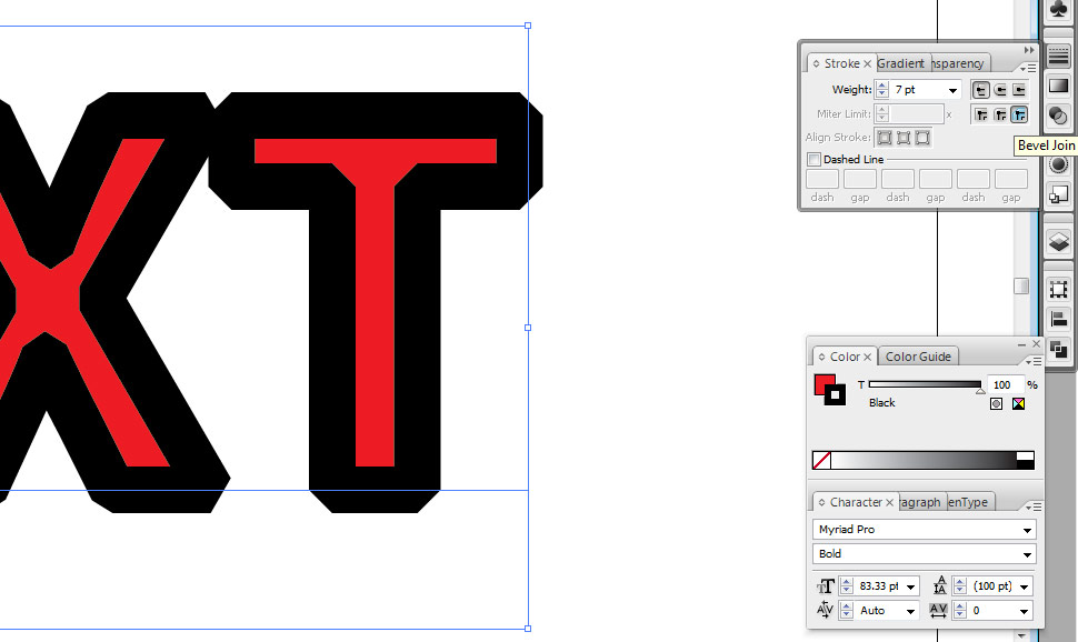
You'll notice those 6 little boxes next to the stroke weight drop box.

A stroked pen path will show us the effects of the top three options.  The first box is the default setting.  The line terminates in a "Butt Cap" that ends in a flat line at the last point:


The second option rounds off the end of the line and is appropriately called "Round Cap":


The third option is flat like the "Butt Cap," but the end juts out from the end of the last point.  This options is called "Projecting Cap."


The bottom three options are best illustrated with stroked text.  The default option is called a "Miter Join."


The second option is called "Round Join."  The effect is that all the corners become rounded:


The third option is called a "Bevel Join."  The effect is that the corners terminate as angles:


There are many applications for these stroke options.  I mostly use different settings to fix text that is exhibiting a weird stroke.  For example, suppose you need a huge stroke on some text, but the lines end up looking like this:


A good way to fix this is to change the stroke settings to "Round Join."  This is what you end up with:


You could place this behind unstroked text to create a nice stroke effect that doesn't eat into the letters.


Enjoy :)

Friday, June 17, 2011

Know Your "Place"

There is a handy-dandy little function in Adobe Illustrator called "Place."

You can find it here:


If you haven't tried it, allow me to introduce you.

Suppose you want to bring an image into Illustrator, but you anticipate that the picture may change.  For example, I was recently working on a piece of concept art for a contest.  I scanned the drawing and fixed it up a little in Photoshop, but I wanted to add some text.  I like Illustrator for text, so I saved the drawing as a .PSD (Photoshop Document).

I placed the .PSD in the Illustrator file and added text.  After adding the text, I decided to alter the drawing.  I made changes to the .PSD and saved.  Once the .PSD is changed and saved, Illustrator recongnizes that the original placed file has changed and automatically updates the image.

This function is fantastic for certain types of work.

And now you know how to use it.  Enjoy!

BTW, here is the concept art i was working on:


Thursday, June 2, 2011

5 Super Useful Shortcuts for Illustrator Users


I'm a Graphic Designer, which means I use Illustrator a lot.

In an attempt to help my fellow budding Graphic Designers, here is a short list of 5 super useful shortcuts.

1)  Do you click on the General Selection Tool when you want to deselect something?  Why bother?  Hit Alt-Ctrl-A instead and you will magically deselect everything.

2)  Maybe you need to select the stroke on an entire line of expanded text.  You could click on every stroke, or you could move up to your toolbar and hit Select > Same.  You can choose to select all objects with the same fill, stroke, stroke weight, etc.  Super time saver.  Seriously.

3)  Relating to the Select > Same function is the Hide command.  Suppose you want to select all objects that are filled with red, except for one lowly graphic outside the art board.  Select the offender and mash Ctrl-3.  Voila, the object disappears.  When you're ready for it to reappear, just push Alt-Ctrl-3.

4)  Perhaps you have some text you want to edit on top of a shape.  If you try to drag the selection tool you will select the background shape and the text.  Solution?  Select the shape and push Ctrl-2.  Your selection will lock, which means it can't be selected until it's unlocked.  You unlock it by smacking Alt-Ctrl-2.

5)  If you want to copy a shape, rather than selecting copy and paste, just hold Alt while you drag the object.

There you go.  5 useful shortcuts.  Enjoy!

Tuesday, May 3, 2011

Random Inking Tip

I picked up this little nugget the other day.

Hold your drawing at an angle when you're inking, either by using a drawing table or inclining your drawing board.  You'll see your drawing more accurately when you ink at an angle.